Botón de Envío con Efecto Hover
- Creamos una carpeta para nuestro proyecto.
- Dentro de la carpeta, crear un archivo
index.htmlystyles.css. - Por último, vinculamos el archivo CSS al archivo HTML.
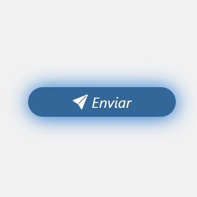
En este proyecto, hemos diseñado un botón moderno y elegante que incluye un efecto de hover. Este botón es ideal para usar en formularios de inicio de sesión o cualquier otra interacción donde se requiera un botón de acción claro y atractivo. Al pasar el cursor sobre el botón, cambia de color y muestra una sombra, lo que proporciona un feedback visual atractivo al usuario.
Código HTML<!DOCTYPE html>
<html lang="es">
<head>
<meta charset="UTF-8">
<meta name="viewport" content="width=device-width, initial-scale=1.0">
<link rel="stylesheet" href="styles.css">
<link rel="stylesheet" href="https://cdn.jsdelivr.net/npm/bootstrap-icons@1.11.3/font/bootstrap-icons.min.css">
<title>Botón con Efecto Hover</title>
</head>
<body>
<section class="contenedor-boton">
<button class="boton">
<i class="bi bi-send-fill"></i> Enviar
</button>
</section>
</body>
</html>*
{
margin: 0;
padding: 0;
box-sizing: border-box;
font-family: system-ui, -apple-system, BlinkMacSystemFont, 'Segoe UI', Roboto, Oxygen, Ubuntu, Cantarell, 'Open Sans', 'Helvetica Neue', sans-serif;
}
body {
background-color: #f1f1f1;
}
.contenedor-boton {
display: flex;
justify-content: center;
align-items: center;
height: 100vh;
}
.boton {
width: 300px;
height: 60px;
border-radius: 30px;
border: none;
background-color: #336699;
color: #fff;
font-size: 20px;
cursor: pointer;
transition: all 0.3s ease;
position: relative;
overflow: hidden;
}
.boton:hover {
background-color: #2b4d66;
box-shadow: 0 0 20px rgba(0, 0, 0, 0.2);
}
.boton i {
margin-right: 10px;
}